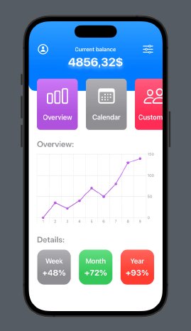
Look at the picture no. 1
Stacks
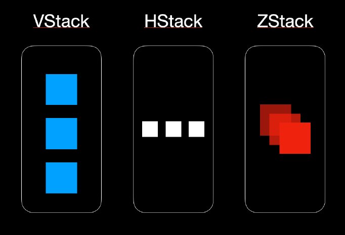
In all views created with SwiftUI, we can observe one basic pattern.
Each contains Stacks in three axes: Vertical – VStack, Horizontal – HStack and along the Z-axis – ZStack.
They allow us to simply arrange the sub-views and organize them on the screen. With their help we will build the already mentioned user interface.
Look at the picture no. 2
From elements to complete view
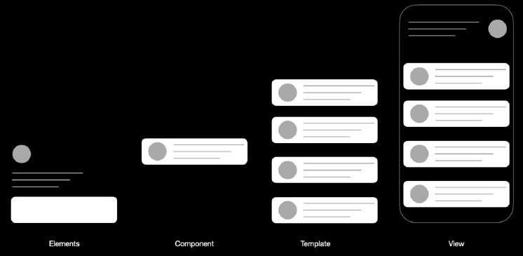
Building views in SwiftUI is very often based on creating single, reusable components that we can later combine into one complete view. This approach is also known as atomic-design in web development.
Look at the picture no. 3
Geometry reader
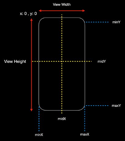
One of the built-in „tools“ that assists iOS developers in their work is Geometry Reader. With its help, we can read many dimensions or offset positions measured in pixels from the screen we are currently on.
struct GeometryReaderView: View {
var body: some View {
GeometryReader { geometry in
VStack {
Text("Some view")
}
}
}
}
Look at the picture no. 4
HeaderView
Let’s build our first component. It will be a HeaderView, which we will use later in the complete view of our application.
import SwiftUI
struct HeaderView: View {
var width: CGFloat
var height: CGFloat
var body: some View {
ZStack {
VStack {
HStack {
Image(systemName: "person.circle")
.font(.system(size: Constants.xlFont))
Spacer()
Text("Current balance")
.font(.system(size: Constants.smallFont, weight: .semibold))
Spacer()
Image(systemName: "slider.horizontal.3")
.font(.system(size: Constants.xlFont))
}
.foregroundColor(.white)
.padding(.horizontal, Constants.medium)
HStack {
VStack {
Text("4856,32$")
.foregroundColor(.white)
.font(.system(.largeTitle, weight: .bold))
.shadow(color: .white.opacity(0.5), radius: 5, x: 0, y: 7)
}
}
.padding(.horizontal, Constants.medium)
}
}
.frame(width: width, height: height / 4)
.background(Color.blue.gradient)
.cornerRadius(Constants.cornerRadius)
}
}
struct HeaderView_Previews: PreviewProvider {
static var previews: some View {
GeometryReader { geometry in
HeaderView(width: geometry.size.width, height: geometry.size.height)
.previewLayout(PreviewLayout.sizeThatFits)
}
.edgesIgnoringSafeArea(.top)
}
}
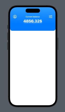
As you may have already noticed, our view is built from the previously mentioned stacks. The main view is ZStack, with V and H-Stacks stored sequentially as sub views. This allows us to obtain the effect of overlapping elements. We also declared two variables – width and height. When we initialize this component in the main view, we will pass the values of the geometry reader to these variables. They are then assigned in the .frame modifier, specifying the height and width of our component. The preview below demonstrates initially how the geometry reader can be used to display the view.
If we wrote the above code correctly, our component should look like in the image below:
Look at the picture no. 5
Category View
The next step will be the component construction, called CategoryView. We will use Xcode’s built-in Sf-Symbols. Our component will then be used for a horizontally scrolling view containing as many categories as we declare to it.
import SwiftUI
struct CategoryView: View {
var image: String
var text: String
var color: Color
var body: some View {
VStack {
Spacer()
Image(systemName: image)
.font(.system(size: Constants.xxlFont))
Spacer()
Text(text)
.font(.system(size: Constants.mediumFont, weight: .semibold))
Spacer()
}
.frame(width: Constants.cardWidth, height: Constants.cardHeight)
.background(color.gradient)
.foregroundColor(.white)
.cornerRadius(Constants.cornerRadius / 2)
.padding(.trailing, Constants.xlmedium)
}
}
struct CategoryView_Previews: PreviewProvider {
static var previews: some View {
CategoryView(image: "calendar", text: "Calendar", color: Color.purple)
}
}
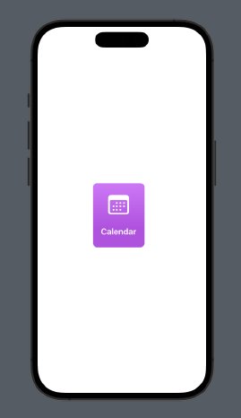
Again, you may notice that here we are using very basic elements like VStack and Image. Modifiers such as background or foreground color allow us to easily give visual effects to our component.
Our component should look like on the image below:
Look at the picture no. 6
Categories View
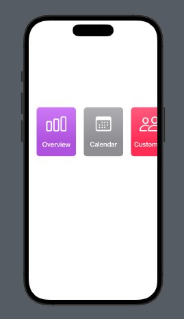
The next component is the above-mentioned horizontal scrollview containing several tiles (categoryView) we created. For this view, we declare three arrays containing colors, images and a description of each category. Next, we declare our scrollView with the axis marked as horizontal. Inside, it contains an HStack and a ForEach loop that generates our tiles with the values specified in the arrays.
import SwiftUI
struct CategoriesView: View {
let colors = [Color.purple, .gray, .pink, .yellow, .cyan]
let images = ["chart.bar", "calendar", "person.2", "envelope", "message"]
let texts = ["Overview", "Calendar", "Customers", "Products", "Messages"]
var width: CGFloat
var height: CGFloat
var body: some View {
ScrollView(.horizontal, showsIndicators: false) {
HStack {
ForEach(colors.indices, id: \.self) { i in
CategoryView( image:
images,
text: texts,
color: colors
)
}
}
.padding(.horizontal, Constants.medium)
}
.frame(width: width, height: height / 8)
.offset(y: Constants.offset)
}
}
struct CategoriesView_Previews: PreviewProvider {
static var previews: some View {
GeometryReader { geometry in
CategoriesView(width: geometry.size.width, height: 150)
.previewLayout(.sizeThatFits)
}
.padding(.top, 350)
.edgesIgnoringSafeArea(.top)
}
}
Look at the picture no. 7
Chart View
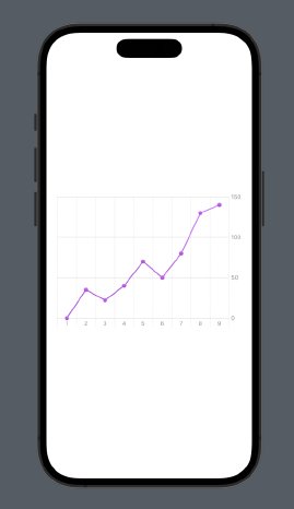
One of the very nice features that were added to SwiftUI with iOS 16 are Swift Charts. With them we can easily visualize data in our view. Below, for the purpose of our small app, we declare a structure with values, which we will then use in our chart.
import Foundation
struct ChartItem: Identifiable {
var id = UUID()
var type: String
var value: Double
}
let chart_items: [ChartItem] = [
ChartItem(type: "1", value: 0),
ChartItem(type: "2", value: 35),
ChartItem(type: "3", value: 22),
ChartItem(type: "4", value: 40),
ChartItem(type: "5", value: 70),
ChartItem(type: "6", value: 50),
ChartItem(type: "7", value: 80),
ChartItem(type: "8", value: 130),
ChartItem(type: "9", value: 140), ]
Next, using PointMark and LineMark charts, which we will overlay on top of each other, we will display our chart. As you can see, for the x-axis we declare item.type and for the y-axis, item.value. Additionally, we assign colors using the foregroundStyle modifier and we’re done.
import SwiftUI
import Charts
struct ChartView: View {
var width: CGFloat
var height: CGFloat
@State var chartItems: [ChartItem] = chart_items
var body: some View {
HStack {
Chart(chartItems) { item in
LineMark(
x: .value("Department", item.type),
y: .value("Profit", item.value)
)
.foregroundStyle(Color.purple.gradient)
PointMark(
x: .value("Department", item.type),
y: .value("Profit", item.value)
)
.foregroundStyle(Color.purple.gradient)
} .frame(width: width - 48, height: height / 4)
}
}
}
struct ChartView_Previews: PreviewProvider {
static var previews: some View {
ChartView(width: 400, height: 1000)
}
}
Look at the picture no. 8
Detail View
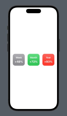
Let’s add another component. It will be a detail view, showing percentage changes in a day, week or month. In truth, here we can provide any data, but for the moment we are just focusing on the basics of SwiftUI. Here we similarly declare an array of values and in a ForEach loop we generate successive tiles of our view.
import SwiftUI
struct DetailView: View {
var width: CGFloat
var height: CGFloat
let periods = ["Week", "Month", "Year"]
let values = ["+48%", "+72%", "+93%"]
let colors = [Color.gray, Color.green, Color.red]
var body: some View {
VStack {
HStack(spacing: Constants.medium) {
ForEach(periods.indices, id: \.self) { i in
VStack(spacing: Constants.small) {
Text(periods)
.font(.system(size: Constants.mediumFont, weight: .semibold))
Text(values)
.font(.system(size: Constants.bigFont, weight: .bold))
}
.foregroundColor(.white)
.frame(width: width / 4, height: height / 8)
.background(colors.gradient)
.cornerRadius(Constants.cornerRadius)
}
}
}
}
}
struct DetailView_Previews: PreviewProvider {
static var previews: some View {
DetailView(width: 400, height: 800)
}
}
Look at the picture no. 9
Text View
One component that does not need to be separated is TextView. In order to keep our code and folder structure clean, we will isolate it into a separate component. This is already the last of our reusable components, in the next step we will put our view together.
import SwiftUI
struct TextView: View {
var text: String
var body: some View {
HStack {
Text(text)
.font(.system(size: Constants.bigFont, weight: .semibold))
.foregroundColor(.gray)
Spacer()
}
.padding(.top, Constants.medium)
.padding(.horizontal, Constants.medium)
}
}
struct TextView_Previews: PreviewProvider {
static var previews: some View {
TextView(text: "Details: ")
.border(.black)
}
}
Final View
It’s time to build our complete view. As you can see in the code below, we start the structure by declaring GeometryReader. Then we assign the screen dimensions to the width and height variables. The next step is to place subcomponents in the ScrollView to make it scale well on screens of different sizes. ScrollView is also a Vstack so we don’t need to nest another view. Next, one below the other, we declare the components we built during this tutorial. Some of them take our width and height values from the GeometryReader as arguments. Additionally, we declare a variable labelled @State, which we will use to change the height of our chart. By using the ternary operator, the onTapGesture modifier and withAnimation, we have easily given our view some user interaction. It’s time to build the whole thing and run the simulator to see the results of our work.
import SwiftUI
import Charts
struct DashboardView: View {
@State private var resize = false
var body: some View {
VStack {
GeometryReader { geometry in
let viewWidth = geometry.size.width
let viewHeight = geometry.size.height
ScrollView {
HeaderView(width: viewWidth, height: viewHeight)
CategoriesView(width: viewWidth, height: viewHeight)
TextView(text: Constants.overview)
ChartView(width: viewWidth, height: resize ? viewHeight * 2 : viewHeight)
.onTapGesture {
withAnimation(.spring()) {
resize.toggle()
}
}
TextView(text: Constants.details)
DetailView(width: viewWidth, height: viewHeight)
}
}
.edgesIgnoringSafeArea(.top)
}
}
}
struct DashboardView_Previews: PreviewProvider {
static var previews: some View {
DashboardView()
}
}
Look at the picture no. 1
Author: Michał Gabrielczyk, iOS Developer
Follow us!
www.linkedin.com/company/convistapoland
Blog | Convista

