A symbol that unites many aspects
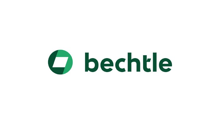
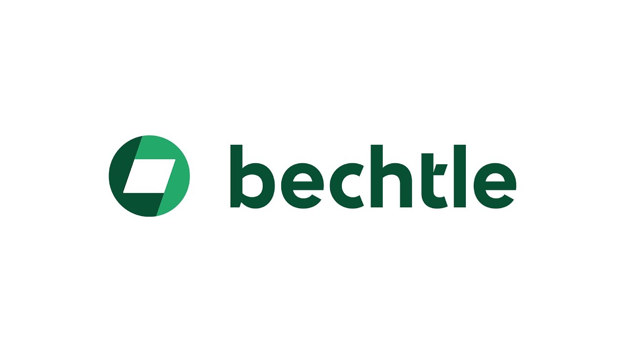
Bechtle's new visual identity has been molded to the company's brand identity, with zukunftsstark (roughly "future-first") at its core, along with the attributes connected, entrepreneurial, and experienced. A circle composed of two sections forms the new logo, symbolizing strong connections fusing into a single entity that channels a world of facets such as experience and future, people and technology, or empathy and competence. These pairs combine to create a strong, cohesive unit.
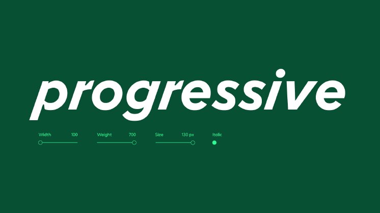
The rhombus in the center of the circle echoes the original logo and stands for openness to the future. Its 19-degree slant is reflected throughout the entire corporate design, for example in the layout system, icons and illustrations, as well as in the new, proprietary font called Bechtle Pro. The company name now appears alongside the symbol rather than within it, and is no longer capitalized, giving the wordmark a unique and more memorable appeal.
Green as a stand-out color choice
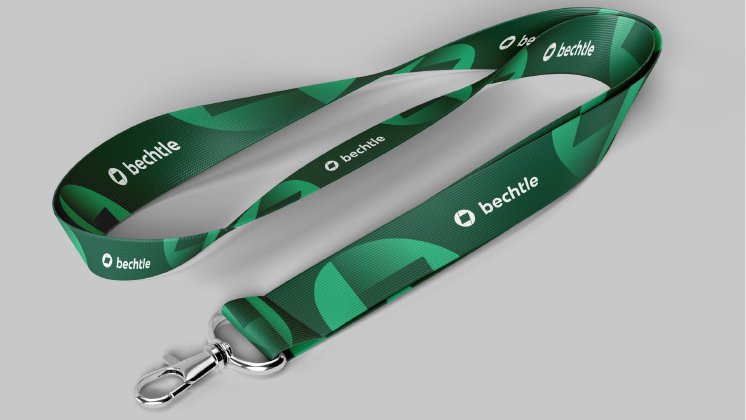
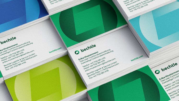
The new color palette reflects the history of the company, dating back to its founding in 1983. The familiar Experience Green sets Bechtle apart in the IT industry and will continue to play a leading role in the future, complemented by two new, vibrant shades: Progressive Green and Future Green. Additional accent colors were selected to comply with the accessibility requirements for corporate websites that will come into effect in 2025, making it easier for visually impaired users to consume digital content. “We took a systematic, digital-first approach to designing the brand appearance,” explained creative director Ulrich Aldinger. “The result is an unmistakable digital impression and a visualization of the very essence of Bechtle – a progressive, successful, digital enterprise that aspires to shape the future with IT.”
A partner for the future and a modern employer
“The new corporate design underscores our ambition of establishing Bechtle as a future-first IT partner in Europe as well as a modern employer. We're creating a very recognizable visual context that clearly distinguishes us from our competition. It's the perfect canvas that allows us to heighten awareness of our brand and continue to bolster our positive image,” said Dr. Thomas Olemotz, CEO of Bechtle AG.
Sabine Brand, director of corporate communications and brand management at Bechtle, said, “In introducing our new corporate design, we're translating the very identity of our brand into a holistic visual style that blends our core values and strategic messages into a vibrant, consistent and confident face to the market. It balances the way we position our brand and the way our brand is perceived, helping us establish Bechtle as a strong, trusted and prominent B2B brand and a future-first service provider across Europe.”
Alexander Tibelius, head of corporate design at Bechtle AG, added, “Together with Peter Schmidt Group, we've achieved a convincing, multi-faceted and bold, yet very approachable and fresh design that will fully unfold its impact in the digital space. Close relationships with our customers and partners, personal contact, and our appetite to engage with people are all hallmarks of Bechtle – the new design fits all our touchpoints like a second skin.”
The new corporate design will initially be introduced across all digital channels, then from 2025 successively at all of the Bechtle group's physical locations throughout Europe.
