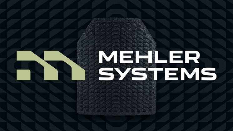
They created the corporate design on the basis of product performance: The striking brand pattern was created using a flexible grid system derived from an abstract interpretation of the functionality of impact protection equipment. All brand assets are derived from the pattern: Logo, iconography, illustrations and a numbering system. Employing the codes familiar to the security sector, the visual identity also has a new color palette of tones associated with high performance.
“If performance comes first, then the branding should also be able to improve the product,” says Ulrich Aldinger. “That was exactly our aim: Applied as a texture on protective plates, helmets, and clothing, the design is improving their resilience. But it also makes clear that the equipment was made by Mehler Systems whereas previously the only branding was that of the special forces. We are proud that this design proved to be a successful solution for the judges, too.”
The new design was introduced at the Milipol trade fair in Paris in November 2023. Since then, it has been present at more and more touchpoints and helps Mehler Systems to address its target group effectively. “Our new visual identity is a significant upgrade as it amplifies our ability to communicate the quality and efficiency of our offerings and enriches the overall brand experience of Mehler Systems and its sub-brands.”, explains Nejc Zavrl, Group Director Marketing, Mehler Systems.
Find out more about the project here.

