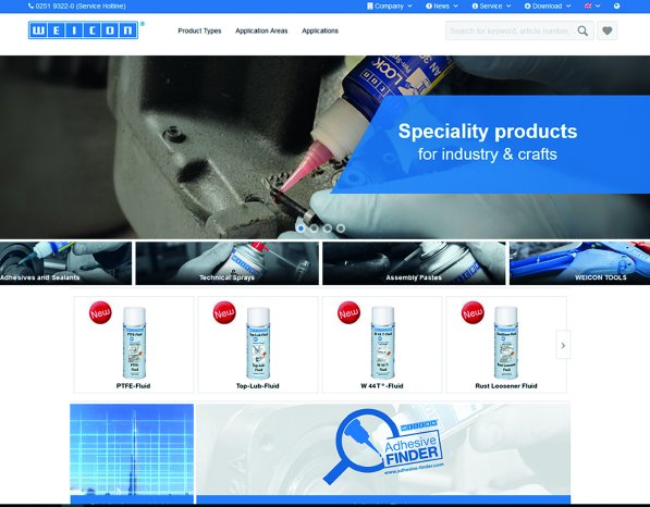
"Our goal was to improve the site and adapt it to the current state of technology. As the majority of users go online with their mobile devices, our website should not just look good but also be accessible without restriction on all devices – it should be responsive to be precise", says Sascha Beilmann, head of Weicon Information Management.
What is responsive design?
Responsive Web Design means that websites automatically adapt to the device that opens it. That means that a responsive website looks on a smartphone a little bit different than on a tablet computer or a notebook. This affects in particular the arrangement of different elements of the site, such as the navigation, page columns and texts. Due to the responsive design the look and the usability are improved and that leads to a clear increase of the benefits for the user.
In addition to these technical improvements, the content of the site has also been revised fundamentally. An important aspect was to adapt the content to the needs of the target groups. The Customer Experience Improvement had a central role in this context.
Products in focus
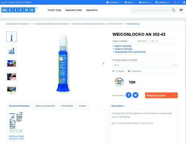
Visitors of the site are particularly interested in information about the extensive product range of Weicon. Due to this reason, this part of the website was revised and contains much more information than before. Now the user gets all available information and data directly on the product page. This means that you get safety data sheets, technical data, photos, videos, product information and brochures on one single page directly at a glance!
In addition, the users will be informed about all news from Weicon and all upcoming events and exhibitions, on the new website
"We are glad to invite you to test our revised site. Check out the latest features and send us a feedback. So we can keep on working and improve the website for our users in future”, Beilmann continues.


