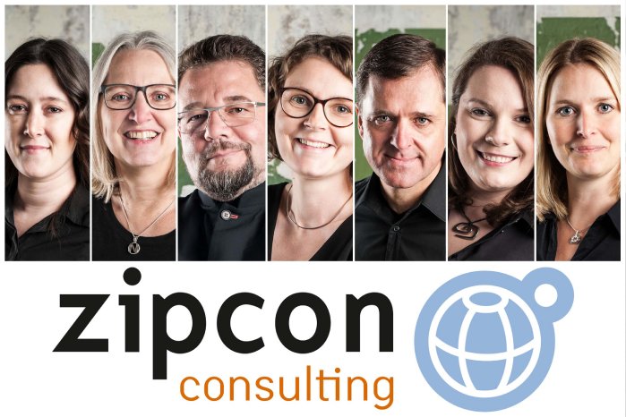
The last relaunch of zipcon.de took place in 2015. That doesn't seem like a long time ago, however, it was high time to incorporate the technical advancements and trends of the last few years. After all, there are continuous improvements and innovations, especially in terms of responsive design, user-friendliness and speed - and it is precisely these that were now incorporated into the zipcon website.
The new zipcon.de homepage - which is also available in English - looks fresh and clean. It offers key information on all aspects of zipcon consulting's activities and acts as a central hub for providing interested parties with information on, for example, the "Beyond Print" blog, which is highly regarded in the industry, the "Online Print Symposium" (OPS), the live event for national and international online printers, or the "Initiative Online Print" (IOP) association.
Even more reduced and focused
While the previous website design was neither outdated nor did the team no longer like it, they wanted to bring in a breath of fresh air and make the information even more concise and to the point. As it is known, the first few seconds of a user's visit to a website will determine whether they continue to read and click through or lose interest. That's why it was all the more important for Bernd Zipper, CEO of zipcon consilting, to formulate the key facts in a short and concise way:
“After all, not only do we focus on our core competencies in our real-life activities, but we wanted to reflect precisely this on our new website. At first glance it is recognizable who we are and what we do - this was very important to us. The UX (user experience) was to be improved again and by using a new CMS (content management system), it has also been made easier for our team to use. For me, the new zipcon.de is the perfect combination of functionality and aesthetics.”

